Case Study
Glide App Layouts
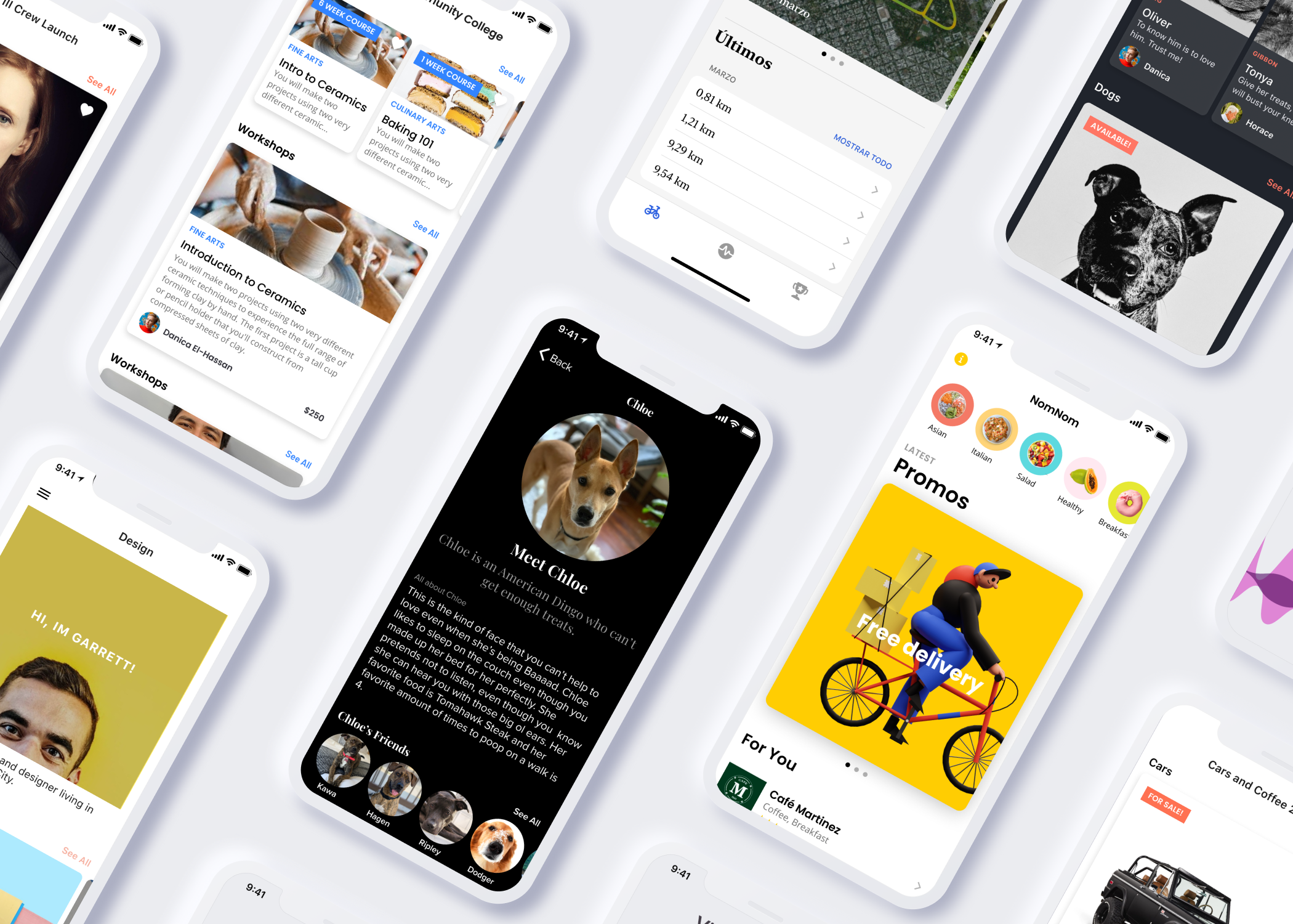
Glide turns rows of spreadsheet data into visual app components that already work and look great by default. With few layouts in the early days, users were limited in how to customize the design of their apps.
My Glide apps all look the same. How can I make my apps look more customized for each client?
A popular user request was to have more variety and control over the way their apps looked at a high level. Users who would build multiple apps for clients would realize that no matter how much they customized, their apps would have a similar look and feel. The best entry point to tackle the challenge of customization is through the highest level of formatting, “Layouts.” This project drills into the layout with the most potential for flexibility, “Tiles.” The goal of this project was to add and define the variables that would maximize variety with minimal visual error (such as overlaps, illegibility).
I explored the following variables in bold:

Try it: Build an app for free!
Role: Product Designer
Product Team: Jason Smith, Antonio Garcia Aprea, Tru Narla

In order to test how each of these elements would work together in concert, we performed a rigorous study of how each individual variable would be designed. This informed us which variables had dependencies on one another, and at what point certain features could not work in combination with other settings. The result was a palette of controls that gave our users tens of thousands of different tile permutations that could be mixed and matched across the app. We saw adoption of the new features within hours of release, and users abandoned previous methods of embedded text into images to achieve the visual effects they sought after.

Aspect Ratios
In the original design, there were only 3 available aspect ratios, all in a landscape format. We discovered that these shapes did not accommodate the variety of content our users represented in imagery, such as book covers, portraits, and standard photography formats. In order to provide a better crop experience, we introduced 2 new aspect ratios, both in landscape and portrait format.

Vertical Scrolling
Testing the new image shapes across 1-4 columns was important to anticipate where captioning and overlay conflicts would fall in future designs. The longer landscape aspect ratios of 1:2 and 1:3 start to feel extremely small in 4 columns, but the portrait shapes still read well.
Horizontal scrolling
By introducing a horizontal scroll feature for lists, it’s easier to see an inline list in your app next to other components. Lists no longer dominate the entire screen. By compressing the gutter between list items to 8px instead of 16px, we were able to give an 8px peek of the next item in the list.
Text Position and Alignment
With the introduction of 2 new image sizes and 4 new aspect ratios, it was important to consider the legibility of text relative to the size of the image on the screen. I explored different text positioning (overlay or below image) and alignments for a small, medium, and large size, as well as a small caps option.

The new system of text overlays was “stress-tested” against a diverse set of images to study legibility and inform the overlay image treatments. To reduce contrast and color clashing errors, we settled on a white text against a darkened overlay.


When the text position is below the image, no Alignment ENUM picker is needed.

When the text position is “Overlay”, the Alignment ENUM picker appears.
Large Text
This text family works great for headers, large full-span images, and accessibility.
Small Text
This text family works best on images in the 3-4 column range, or for the longer 1:3 aspect ratios to conserve height
Overlays
Overlays allow richer information from a row to be surfaced on the tile image. It also create a path to put interactive elements on top of images that will change the status of a row, such as Favorite, Liking, Ratings, Buy buttons. Overlays generally surface more categorical information, such as tags, user information, authorship relevant to each image so that users can get a better idea of what will be on the details page if you go a layer deeper.
Since overlays are tied to data, the way they are configured in the panel is similar to the way data is configured.


A leaner, more streamlined configuration panel
After introducing so many new controls, it opened an opportunity to re-examine the side panel. Most of the new controls were being pushed below the fold. By developing a more consistent single-line alignment, condensing the ENUM picker UI, and tightening the height of all elements, we were able to reveal twice the controls that were available in the first iteration.

Final result in context


ENUM picker explorations.
Sample apps with combined layouts
There are now over 20,000 design combinations possible with the introduction of new aspect ratios, text positioning, alignments, sizes, and overlays.
